
Key driver/influencer analysis using the newly released Power BI “Key influencers” visual.
Key driver analysis or key influencer analysis is critical to understand what factors impact an outcome and/or what is the relative importance of a factor. Example:
What influences employee attrition? Overtime? Job Level?
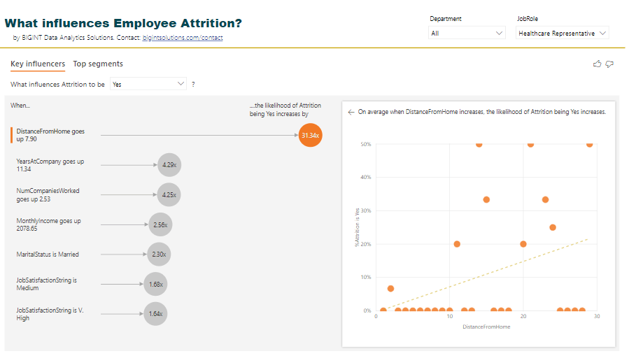
What influences employee attrition in the Sales Executive role? Distance from home?
What influences customer attrition? High call rate? International Voice plan?
Knowing answers to above helps in decision making.
If employees in Job Role “Healthcare Representatives” leave the most because of the distance from home, maybe offer them fuel reimbursement or maybe offer them accommodation expenses if they stay near to office?
The newly released Power BI “Key influencers” visual (released as part of Feb 2019 Power BI Desktop release) aids such analysis very very quickly with no code! Crazy!
We applied this new visual to analyze what drives employee attrition, and I must say, I’m blown away by the outcome, ease of use, and comprehensiveness of the visual.
Download Power BI report and play with the visual.
But, how does the result look like?

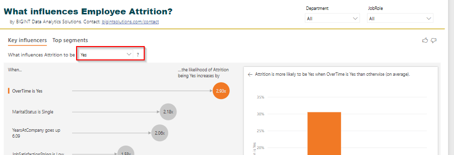
From the visuals above we can clearly see what influences our variable Attrition=Yes. OverTime, MaritalStatus, YearsAtCompany, JobSatisfaction, and so on.
Not only that, the visual also provides the values of the factors which influences our variable of interest the most.
How to interpret the visual?
The likelihood of attrition increases by 2.93x if employees are doing overtime. Or, Attrition is 2.93x more likely in the employees who are doing overtime.
Hmm… if you do overtime, you may quit. This is obvious.
The attrition is 2.18x more likely if employees are single!
Attrition is also high if the Department is Sales.
And so on.
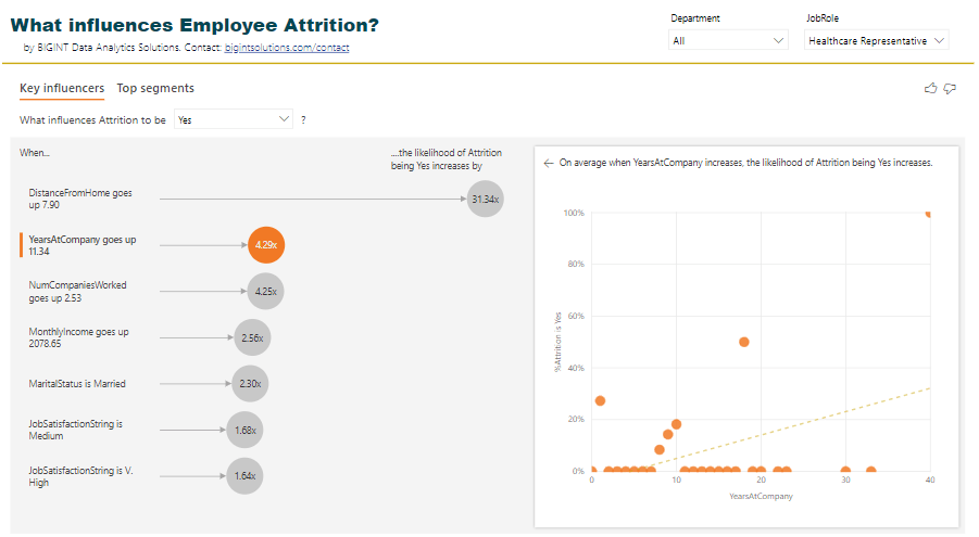
The left-hand side view of Key influencers shows all the factors influencing our “Attrition=Yes” by a factor of 1.0 and above.
The right-hand side view shows the distribution of data with respect to the selected factor and Attrition either as a column chart or a scatter plot.
The dashed line shows Avg. Attrition % of all values except for the key influencer one (in this case except for OverTime = Yes)
There is another view of this visual where we can see Top segments with high attrition % and their characteristics.

The visual identified 4 segments with high attrition % along with population count. Clicking on a bubble shows us the characteristics of that segment.
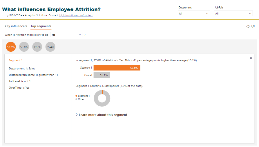
Segment 1 with Attrition % as 57.6 has employees in Department Sales, DistanceFromHome > 11, JobLevel is high and OverTime is Yes.
Wow!
You can further drill down this segment by clicking on “Learn more about this segment” and see what other factors influence this segment.
Quick FAQs on Key influencer visuals and its outcome
Can I filter this visual?
Yes, you can. Example: Why are employees in job role “Healthcare Representative” leaving the company?
Is the visual interactive?
Yes, you can select individual influencing factors and see the distribution of Attrition % by the selected factor.
Can I hover over the values in the scatter plot above?
Yes, you can!
Can I see the logic or p-values associated with factors or key influencers?
No, not yet. This visual is in preview mode. Power BI team may add this feature in the future. Not sure about this.
Can I just see the top X key influencers?
No, not yet. This visual is in preview mode. Power BI team may add this feature in the future. Not sure about this.
I do not see my key influencer in this visual?
Yes, this can happen. Based on my R code using RandomForest, Age should also be an influencing factor for attrition but doesn’t show up in Power BI visual.
See this scatter plot. If Age decreases, Attrition % increases. Maybe Power BI just checks how the “increase” direction of a factor increases Attrition % or Maybe the number of data points for lower age and high attrition is less.

Can I export the data for segments?
No, not yet. This visual is in preview mode. Power BI team may add this feature in the future. Not sure about this.
Does this visual analyze multiple factors and provide conclusions?
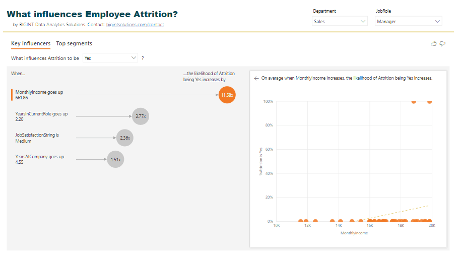
I do not think so. In the example below, the likelihood of Attrition % increases by 11.58x if monthly income goes up. But why is that so? Could it be because for those employees the YearsAtCompany is also more?
Maybe Power BI visual needs to remove outliers.
Power BI visual, currently, doesn’t analyze this for us.
I want to set this up for my data?
Ok, here are steps to achieve this.
Step 1: Download and Install Power BI Desktop Feb 2019 from here.
Step 2: Enable this visual from “Preview features”.

Step 3: Restart Power BI Desktop. Click on the visual highlighted to put it on the canvas.

Step 4: In the visual data options, drag the field to analyze in “Analyze”, and possible influencers in “Explain by”.

Note: The visual is evaluated on the table level of the field being analyzed. In this case, we are analyzing Attrition, and hence the visual runs at an Employee level. So you may not need aggregations on “Explain by” field. Otherwise, appropriate aggregations are required.
Step 5: In the visual select “Yes” in Attrition value. In your case, select the value you want to analyze.
Step 6: Share analysis with your boss/team/company, and say Thank you to us 🙂
No code, drag and drop solution to key influencers analysis in Power BI!
Simple, huh?
Thanks
Ranbeer
PS: This visual is currently not supported in Power BI Embedded, Publish to Web and Power BI Mobile scenarios.
Download Power BI report and play with the visual.