What is Microsoft Fabric: A beginners guide

Microsoft Fabric is a new SaaS data platform announced in MS Build Conference on May 23, 2023.

As per the official doc

Microsoft Fabric is a unified data platform in the era of AI.  Fabric integrates technologies like Azure Data Factory, Azure Synapse Analytics, and Power BI into a single unified product, empowering data and business professionals alike to unlock the potential of their data and lay the foundation for the era of AI.

To put it simply, Microsoft Fabric simplifies and unifies data operations. From data ingestion to data engineering, data management, machine learning, real time insights and reporting, you can do all in one unified platform.

The Fabric platform is a SaaS service for data and analytical workloads. The platform provides core capabilities of Azure Data Factory, Azure Synapse, and Power BI.

The platform can be used for:

-> Data Ingestion using Data Factory

-> Data Engineering using Synapse

-> Data Science operations using Synapse

-> Data Warehousing using Synapse

-> Real Time Analytics using Synapse

-> Reporting using Power BI

-> Actions using Data Activator (coming soon)

-> Governance using Purview

Why should I care about?

One obvious questions that comes to our mind is why should I care about it? I can anyways go a create a data pipeline today using Azure Data Factory, I can create Spark notebooks on top of Synapse, and create my reports in Power BI. Why should I go and do the same in Fabric?

The answer is: simplicity and unification.

The answer is: It simplifies data collaboration across multiple data professional disciplines

The answer is: It simplifies licensing and purchasing. You don’t have to spin up multiple capacity and infrastructure for your multiple data workloads

The answer is: It simplifies setup and configuration

The answer is: It simplifies data management. No data redundancy or data silos

The answer is: It simplifies data governance

With Microsoft Fabric – a data engineer can create data pipelines to ingest data, using the ingested data, a data warehouse engineer can create data warehouses, an ML engineer using the same data can create models, and an analyst can create data models and Power BI reports – all within the same platform.

Where is my data stored?

All workloads store the data in something new called as “OneLake”. The way we have OneDrive for documents, Microsoft has introduced “OneLake” for data.

OneLake provides a single, unified storage system for data workloads in Fabric. Each tenant has one OneLake provisioned.

There is also a concept of ShortCuts in OneLake which blows away my mind. You can create “shortcuts” of your data in AWS or other clouds right inside OneLake. This means the data stays in the original source and can be used for analytical workloads right through OneLake.

What happens to current Azure analytics solutions?

As per Microsoft they will continue to remain and provide analytical capabilities as a PaaS. Microsoft Fabric simplifies this in the form of SaaS.

Existing Microsoft products such as Azure Synapse Analytics, Azure Data Factory, and Azure Data Explorer will continue to provide a robust, enterprise-grade platform as a service (PaaS) solution for data analytics. Fabric represents an evolution of those offerings in the form of a simplified SaaS solution that can connect to existing PaaS offerings. Customers will be able to upgrade from their current products into Fabric at their own pace.  

How should I get started?

Head to fabric.microsoft.com and try a free trial today. The free trial is for 60 days that will allow you to create warehouses, lakehouses, notebooks and more.

If you are an existing Power BI customer with Premium capacity, you can try it right away.

How to enable Fabric in my tenant?

You need to go to Power BI Admin portal and enable it.

Once on the admin portal, you can “enable” the setting for the entire org or specific security group

After 15 mins you will see an icon at the bottom left corner in your fabric portal. Clicking on it will take you to the Fabric home page.

Is Power BI same as Fabric?

Somehow I feel this is same as Power BI.

Yes, the experience, the UI and core components of Power BI portal are the same in Fabric. This means:

-> Workspaces

-> Navigation

-> Collaboration

-> Content Management

-> Admin portal

-> Capacity

will look familiar to you.

However Fabric is an umbrella platform and Power BI is a critical component of it.

What happens after free trial?

Starting June 1 you can start purchasing Fabric capacities from Azure to supercharge your data and analytical workloads.

Any more questions? Feel free to ask here in the comments.

Fabric learning resources (from Microsoft)

To help you get started with Fabric, there are several resources we recommend:

  • Microsoft Fabric learning paths: Experience a high-level tour of Fabric and how to get started.
  • Microsoft Fabric tutorials: Get detailed tutorials with a step-by-step guide on how to create an end-to-end solution in Fabric. These tutorials focus on a few different common patterns including a lakehouse architecture, data warehouse architecture, real-time analytics, and data science projects.
  • Microsoft Fabric documentation: Read Fabric docs to see detailed documentation for all aspects of Fabric.

My personal favorite is this YouTube video by Justyna Lucznik, Principal Group PM for Microsoft Fabric, on Microsoft Mechanics channel.

Enjoy!

Power BI Premium Per User license

Power BI Premium Per User (PPU) license

If you ever wanted to try and use capabilities and features provided by Power BI Premium license, now is the time. Starting early Nov 2020 Microsoft Power BI team will be rolling out a new license type in preview. This new license is named: Power BI Premium Per User.

What is Power BI Premium Per User?

In our last post, we touched on two existing Power BI licenses: Power BI Pro and Power BI Premium. If you remember Power BI Premium is a capacity license. If you purchase 1 capacity of this license you can server consumption needs of 450 readers. Read the old post to understand this calculation. But then you have to pay a heft fee of close to $5000 per capacity per month.

Small and mid-size businesses who want to utilize the power of AI, paginated reports, more frequent refreshes, deployment pipelines, and many more features provided by Premium license today got demotivated by just hearing the price.

Power BI Premium per user is a new way to license premium features on a per user basis. With this new license, you get all the capabilities of a pro license along with premium features.

Power BI Pro and Power BI Premium are at the extreme ends of the spectrum. With Power BI Premium per user the gap fills (though only little).

What’s the difference between Power BI Premium and Power BI Premium Per User?

There are some differences. You can check the table below by Microsoft.

Chart comparing the Premium features per user vs. capacity
Source: Microsoft

But there are still report sharing constraints which are outlined in the table below. Example: If you create and share a report in a workspace marked as PPU, a Pro user cannot view/access that report. So you will need all the users to have PPU license to “view” the report.

How sharing works in Power BI with Premium per user
Source: Microsoft

What’s the price for the Power BI Premium per user?

Update: March 10, 2021

Power BI Premium will be priced at $20 per user per month. Isn’t that cheap?

There is no official news on the price by Microsoft. However, the good news is it will be free to use in the preview period.

As per official source: “Premium per user will be uniquely affordable and highly competitive among individual user offerings in the industry

We also don’t know if there will be a min. requirement for the number of PPU licenses.

What’s our thought?

Microsoft clearly says this new license will address the needs to provide a low cost entry point to get access to premium features. However, there will still be more cries than smiles when it comes to users who just need read access. Procuring a Pro or PPU license for them doesn’t make sense even now.

Have more questions?

Head to Microsoft official post on this to know more about scenarios and questions around this.

https://powerbi.microsoft.com/en-us/blog/answering-your-questions-around-the-new-power-bi-premium-per-user-license

When is PPU License launching?

Nov 2020 this new license type is launching in public preview. It will be free to use till GA. We are excited to try and let our users and customers know our first hand experience.

Join our list to be the first one to know more about our first hand experience.

Root cause analysis in Power BI

Root cause analysis in Power BI

Microsoft Power BI has some great AI visuals which can provide an in-depth analysis of your data. In our last post we talked about an AI visual – Key Influencer visual. This visual helps in identifying factors that can impact an outcome. In that post, we analyzed what factors influence employee attrition. We also deep-dived into segments and clusters contributing to employee attrition with graphs and charts.

In this post, we will analyze and play with another AI visual – Decomposition tree.

Decomposition tree

The decomposition tree breakdowns a numerical measure into parts and analyzes what factors cause the measure to be high/low.

From Microsoft documentation:

The decomposition tree visual in Power BI lets you visualize data across multiple dimensions. It automatically aggregates data and enables drilling down into your dimensions in any order. It is also an artificial intelligence (AI) visualization, so you can ask it to find the next dimension to drill down into based on certain criteria. This makes it a valuable tool for ad hoc exploration and conducting root cause analysis.

Microsoft

Let’s take a well known example of employee attrition and understand why attrition is high. From the decomposition tree visual we plan to get answers to the following question:

What causes employee attrition to be high?

At the end of this post you will have an idea of how to use this visual for exploratory and visual analysis, decomposition of values by factors, and how you can use AI splits to dynamically split and understand the next factor for drill down.

Our final output could look like:

Getting Started

We install the latest version of Power BI Desktop, and click on the decomposition tree visual.

Power BI AI visual – Decomposition tree

You see two input fields “Analyze” and “Explain by”. In the Analyze field we put “Attrition %” and in Explain by we put several other fields say “Overtime”, “Department”, “BusinessTravel”, “MaritalStatus”, “Gender” etc. How to choose these fields in the first place? That’s a tricky question and we will answer this later.

Our decomposition tree when we drag Attrition % looks like:

Decomposition Tree with Attrition % metric

Attrition % overall is 16.12%. Our next step once we have added our metric is to understand:

  1. Which of the factors cause attrition % to be high?
  2. Which of the factors cause attrition % to be low?

Remember we have dragged several fields in “Explain by” section? Let’s click on the “+” sign next to the Attrition % bar.

You see the fields you have dragged. In addition, you see two more fields – High value and Low value.

Exploratory and Ad-hoc analysis

We begin with exploratory analysis by analyzing Attrition % by OverTime. Attrition % is 30.53% if OverTime is Yes. This means when OverTime is high attrition will be high.

OverTime

Let’s expand this level and understand when OverTime is Yes then what’s the next factor which contributes to attrition%? Let’s explore Marital Status.

Martial Status

Attrition is high among unmarried individuals and these are the ones who over time. Let’s try adding another level to this analysis, say Department.

Department

Unmarried individuals in the Sales department who over time contribute to 65.31% attrition! We can also verify this number by adding tooltips.

Out of 49 employees in Dept Sales with Marital Status Single and OverTime Yes, 32 of them left the company.

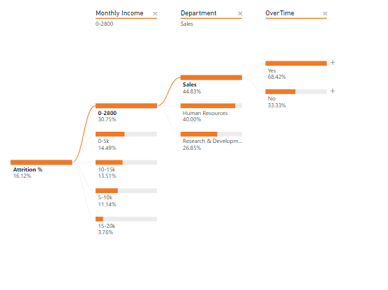
What if we start our analysis, not with OverTime? Let’s pick monthly income as the starting factor

Monthly Income

The visual flow is quite different here! Attrition is highest when monthly income is low and in the Sales department when OverTime is High.

With the decomposition tree, you can perform root cause and exploratory analysis by playing with the multiple factors and dimensions. You not only get a deep understanding of what’s happening in your data set, but you can also visually understand the data in a tree format.

AI Analysis

We started analyzing the factors based on our domain knowledge and understanding of the dataset. What was our rationale for choosing OverTime as the starting point of our tree?

The decomposition tree comes with another option to split the tree using AI algorithms. Remember we had two more options in our tree “High value” and “Low value”? It’s time to utilize them.

Let’s start with a blank slate and this time instead of selecting OverTime, let’s select “High value”.

AI Split

As we keep selecting High value at each level of the tree, the algorithm identifies the next level on its own. In the example above the levels chosen were Monthly Income followed by OverTime, Education Field and JobSatisfication. Attrition % is high when monthly income is between 0-2800, and so on.

In AI splits you see a bulb icon next to the level name. Once you hover on the bulb icon you get to see why this level was chosen.

On hovering the bulb icon

You can also select “Low value”. Once you select the low value you will observe that the factor and analysis changes.

A low value split

How to choose fields in “Explain by”?

Should we choose AI split or manual split?

How do we choose the fields in “Explain by”?

The best way to start analyzing the tree is using manual split based on the domain context and your understanding of the data. After 2-3 levels of manual split, you can then split the tree further using AI splits and understand the factors responsible for making a metric high or low.

There’s also a smart alternative to this. You can use “Key Influencer Visual” to understand what factors lead to Attrition = Yes. The visual will provide top factors impacting an outcome (attrition = yes), and you can put those factors in “Explain by” section of the Decomposition tree. When you run key influencer analysis on the employee attrition data set you will get the results as explained and shown in the previous blog post.

Power BI Key Influencer AI visual

You can put Age, OverTime, JobLevel, MonthlyIncome, YearsInCompany and others in the Explain by section of the decomposition tree visual and start drilling down the data.

Conclusion

The decomposition tree is a smart visual to breakdown a numerical measure into components. This AI visual aids in root cause and deeper analysis as shown above. You can perform ad-hoc analysis for the problem in question, understand the breakdown of values using manual and AI splits, and combine it with other Power BI AI visuals to strengthen your analysis.

One last note: to get the best of the output and results from this visual, you may want to convert numerical attributes like age, income, etc into categorical values (or bins – Example above: monthly income is broken down into 0-2800, 2800-5000 etc. bins).

PS: AI splits in the decomposition tree comes with two analysis mode: absolute and relative. We will cover this in detail in next blog post.

Next steps

If you are looking to explore the possibility of applying AI in your dataset or looking to evaluate the use of Power BI in your organization, don’t hesitate to contact us today.

Company Size(required)

Which BI tool do you currently use in your Org?(required)

Power BI Embedded Licensing

In our last post we talked about Power BI Pro and Power BI Premium. To recap, Power BI Pro is a per use license and is more towards content creation and consumption. On the other hand, Power BI Premium is a capacity license and is more for content consumption.

Rather than assigning a Pro license to every individual in your org, you can assign a premium capacity to a workspace to support large number of content viewers.

In this post we will tackle another Power BI offering – Power BI Embedded.

Power BI Embedded

Power BI Embedded is a Microsoft Azure service that lets independent software vendors (ISVs) and developers quickly embed visuals, reports, and dashboards into an application. This embedding is done through a capacity-based, hourly metered model.

Microsoft

Power BI Embedded is an offering by Microsoft where you can embed Power BI visuals, reports, and dashboards in a custom application or in associated Microsoft Services like Teams or SharePoint Online.

How does Power BI Embedded look like in reality?

Ok, here’s a screenshot of a Power BI report embedded inside a custom application. By custom application I mean an application which is not app.powerbi.com. It can be a plain vanilla website or a WordPress website or can be a heavy application with Reporting and Analytics section.

In the screenshot below, the sections highlighted in red are part of the custom application. The “SALES PERFORMANCE REPORT” or the part highlighted in green is the Power BI report securely embedded in the application.

You can embed a visual, report, dashboard and Q&A. We have used “report” as a general content for embedding. But the description apply to any of the contents.

How can I embed a Power BI report?

There are 3 ways to embed a Power BI report.

  1. Publish to web. Simplest (and not secure) way of embedding is publishing your Power BI report to web for public access. Note: Anyone with the URL will have access to your report.
  2. No-code Embedding – Simplest and secure. This approach gives you a secure URL to the Power BI report which you can put in your application. However, this will prompt you for Org authentication.
  3. Custom Embedding using JavaScript SDK. This gives you full power of embedding capabilities. You can read more about how to embed using JavaScript SDK in our other blog post.

What licensing do I need to support Power BI Embedding?

Now, that’s a tricky question. For embedding you can choose – P SKU, EM SKU or A SKU.

The licensing to go for really depends on your specific scenario. The general answer to choosing the SKU is “where” the content will be consumed.

  • Choose A SKU if the Power BI content will be consumed in a custom application
  • Choose EM SKU if the Power BI content will be consumed in Teams or SharePoint online (SPO).
  • Choose P SKU if the Power BI content will be consumed in a custom application or Teams or SPO.

**You can even choose a P SKU if you are an enterprise or a Large ISV.

The P SKU is an umbrella SKU which not only gives embedding capabilities but additional feature sets including large read users, AI features, and other enterprise features.

Typically, enterprises go with P SKUs.

How are P, EM and A SKUs different in terms of performance?

Here’s a quick summary of each of the SKUs node performance:

Image source: Microsoft

So an A4 node is same as a P1 node in terms of performance.

It is generally suggested to start with A1 to test and benchmark your capacities, and then take necessary steps to increase the capacity.

Is Power BI Embedded free to use?

No. For production workloads you have to choose from either of the licensing types. For dev workloads, yes you can embed without purchasing a capacity. However, you may hit the token limits and reports may not render.

Next steps?

If you have any questions on this or want to explore Power BI for your organization, do contact us today.

Company Size(required)

Which BI tool do you currently use in your Org?(required)

Quick URLs for further reading

Power BI Embedded Capacity: https://docs.microsoft.com/en-us/power-bi/developer/embedded/embedded-capacity

Developer Samples: https://github.com/microsoft/PowerBI-Developer-Samples

Power BI Embedded Playground: https://microsoft.github.io/PowerBI-JavaScript/demo/v2-demo/index.html


I hope this post provides some understanding on Power BI Embedded, licensing and consideration for choosing this type of offering.


Power BI Security & Architecture

Are you an enterprise, CIO or IT decision maker?

Before investing your budgets in a modern BI tool for your organization, we strongly advise to evaluate your BI vendors security and architecture. Whether the tool is Power BI, Tableau, Qlik or Looker, each of these tools provide a cloud BI solution for your needs.

You have cloud and on-premise versions. Using the cloud version offers several known advantages. However, data security becomes the key. There are several questions that might be bothering you.

Is my data secure?

Where is my data stored?

What security options and best practices does the vendor implement?

How is the data movement?

Is the data encrypted? What all is encrypted?

Does this sound like you?


If you are looking for answers to above questions or evaluating Power BI as your go to modern Enterprise BI tool, I invite you to read Power BI security whitepaper which talks about Power BI security and architecture in detail.

To summarize

Power BI is a SaaS platform by Microsoft hosted on Azure. It uses Azure services for its operation. There are Web Front End clusters and Back End clusters.

The WFE and Back End
Image source: Microsoft

Front End cluster

The frontend cluster (WFE) is responsible for initiation and authentication to the Power BI service, sending static files and content.

The WEF Cluster
Frontend (WFE) cluster

Back End cluster

The Back-end cluster role comes into play once the authentication is done. This cluster is responsible for data, storage, visualization, connections, refresh, and other user interactions etc.

The Back-End Cluster
Back-end cluster

The Back End cluster is the heart. If you consider your data as your asset, then the Back End cluster is a critical asset.

You should particularly focus on items to the left of the dotted line above and items to the right of the dotted line. A request to get data, dashboards or reports goes to “Gateway Role” only. This Gateway Role decides where to route the request.

Snippet from the security paper:

The Gateway Role acts as a gateway between user requests and the Power BI service. Users do not interact directly with any roles other than the Gateway Role.

Important: It is imperative to note that only Azure API Management (APIM) and Gateway (GW) roles are accessible through the public Internet. They provide authentication, authorization, DDoS protection, Throttling, Load Balancing, Routing, and other capabilities.

The dotted line in the Back-End cluster image, above, clarifies the boundary between the only two roles that are accessible by users (left of the dotted line), and roles that are only accessible by the system. When an authenticated user connects to the Power BI Service, the connection and any request by the client is accepted and managed by the Gateway Role and Azure API Management, which then interacts on the user’s behalf with the rest of the Power BI Service. For example, when a client attempts to view a dashboard, the Gateway Role accepts that request then separately sends a request to the Presentation Role to retrieve the data needed by the browser to render the dashboard.

The Gateway role
Back End cluster Gateway Role

Top questions asked by customers

Where is my data stored?

The data that you upload along with Power BI Report (PBIX) is stored in Azure Blob Storage. The metadata – data about dashboards, reports, refresh cycles etc. is stored in Azure SQL Database.

The data is stored in the region same as the Power BI tenant’s region.

Read more here: https://docs.microsoft.com/en-us/power-bi/whitepaper-powerbi-security#data-storage-and-movement

Is my data encrypted?

In the Power BI service, data is either at rest (data available to a Power BI user that is not currently being acted upon), or it is in process (for example: queries being run, data connections and models being acted upon, data and/or models being uploaded into the Power BI service, and other actions that users or the Power BI service may take on data that is actively being accessed or updated). Data that is in process is referred to as data in process. Data at rest in Power BI is encrypted. Data that is in transit, which means data being sent or received by the Power BI service, is also encrypted.The data at rest and in transit is encrypted.

Source: Power BI Whitepaper

Is Power BI Pro secure?

Power BI Pro is a shared environment. The Frontend and backend clusters could be shared between customers. Azure Blob Storage and Azure SQL Database could be shared between customers.

Is Power BI Premium secure?

When you initiate a Power BI Premium subscription, behind the scenes the back-end clusters are deployed to dedicated VMs. These VMs are dedicated to you and should not be shared between customers.

What happens when I login to app.powerbi.com?

Check this section in the whitepaper to know what happens behind the scenes when you try to access app.powerbi.com

All Power BI features in one page?

Check out this blog to see all Power BI features in one page!

Planning to migrate to Power BI?

Read this first: https://bigintsolutions.com/2020/04/21/migrate-to-power-bi/

What licensing options does Power BI support?

Power BI supports Power BI Pro and Power BI Premium licensing options. It also has a free version. If you need to know more about different licensing options, check out our Power BI Licensing guide.

I have more questions on security:

Read more here: https://docs.microsoft.com/en-us/power-bi/whitepaper-powerbi-security#power-bi-security-questions-and-answers

Conclusion

Power BI is a great Modern BI tool. When evaluating Power BI for Enterprises, we walk them through the architecture and security implementations in Power BI. This boosts enterprise customer confidence to take next big step in modernizing their reporting and analytics.


Next Steps?

Don’t hesitate to contact us today if you are looking for Power BI Enterprise deployment or want us to evaluate Power BI as your go to modern Enterprise BI tool.

Company Size(required)

Which BI tool do you currently use in your Org?(required)