Root cause analysis in Power BI

Root cause analysis in Power BI

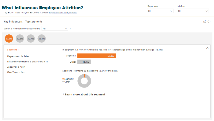
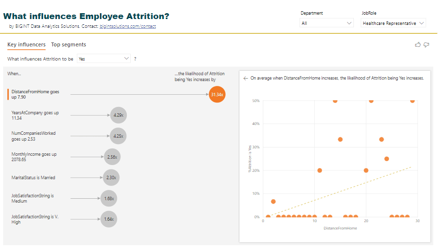
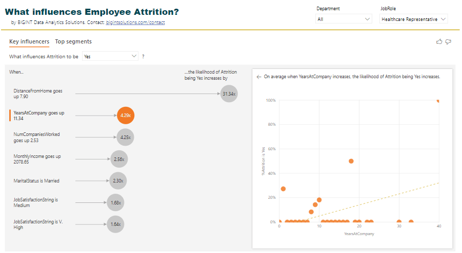
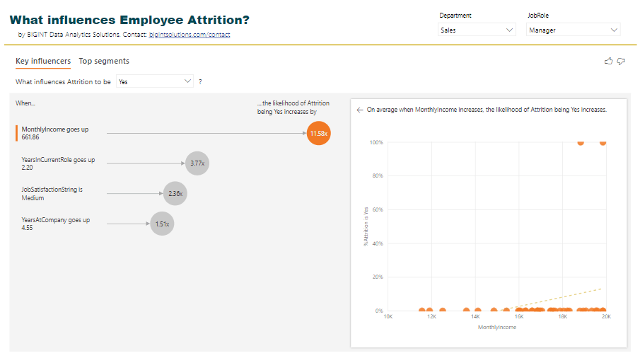
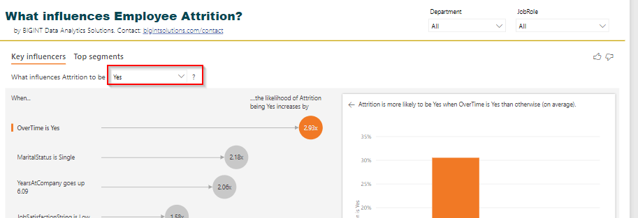
Microsoft Power BI has some great AI visuals which can provide an in-depth analysis of your data. In our last post we talked about an AI visual – Key Influencer visual. This visual helps in identifying factors that can impact an outcome. In that post, we analyzed what factors influence employee attrition. We also deep-dived into segments and clusters contributing to employee attrition with graphs and charts.

In this post, we will analyze and play with another AI visual – Decomposition tree.

Decomposition tree

The decomposition tree breakdowns a numerical measure into parts and analyzes what factors cause the measure to be high/low.

From Microsoft documentation:

The decomposition tree visual in Power BI lets you visualize data across multiple dimensions. It automatically aggregates data and enables drilling down into your dimensions in any order. It is also an artificial intelligence (AI) visualization, so you can ask it to find the next dimension to drill down into based on certain criteria. This makes it a valuable tool for ad hoc exploration and conducting root cause analysis.

Microsoft

Let’s take a well known example of employee attrition and understand why attrition is high. From the decomposition tree visual we plan to get answers to the following question:

What causes employee attrition to be high?

At the end of this post you will have an idea of how to use this visual for exploratory and visual analysis, decomposition of values by factors, and how you can use AI splits to dynamically split and understand the next factor for drill down.

Our final output could look like:

Getting Started

We install the latest version of Power BI Desktop, and click on the decomposition tree visual.

Power BI AI visual – Decomposition tree

You see two input fields “Analyze” and “Explain by”. In the Analyze field we put “Attrition %” and in Explain by we put several other fields say “Overtime”, “Department”, “BusinessTravel”, “MaritalStatus”, “Gender” etc. How to choose these fields in the first place? That’s a tricky question and we will answer this later.

Our decomposition tree when we drag Attrition % looks like:

Decomposition Tree with Attrition % metric

Attrition % overall is 16.12%. Our next step once we have added our metric is to understand:

  1. Which of the factors cause attrition % to be high?
  2. Which of the factors cause attrition % to be low?

Remember we have dragged several fields in “Explain by” section? Let’s click on the “+” sign next to the Attrition % bar.

You see the fields you have dragged. In addition, you see two more fields – High value and Low value.

Exploratory and Ad-hoc analysis

We begin with exploratory analysis by analyzing Attrition % by OverTime. Attrition % is 30.53% if OverTime is Yes. This means when OverTime is high attrition will be high.

OverTime

Let’s expand this level and understand when OverTime is Yes then what’s the next factor which contributes to attrition%? Let’s explore Marital Status.

Martial Status

Attrition is high among unmarried individuals and these are the ones who over time. Let’s try adding another level to this analysis, say Department.

Department

Unmarried individuals in the Sales department who over time contribute to 65.31% attrition! We can also verify this number by adding tooltips.

Out of 49 employees in Dept Sales with Marital Status Single and OverTime Yes, 32 of them left the company.

What if we start our analysis, not with OverTime? Let’s pick monthly income as the starting factor

Monthly Income

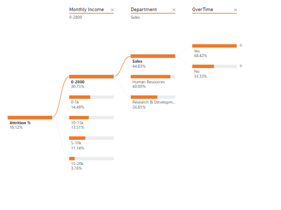
The visual flow is quite different here! Attrition is highest when monthly income is low and in the Sales department when OverTime is High.

With the decomposition tree, you can perform root cause and exploratory analysis by playing with the multiple factors and dimensions. You not only get a deep understanding of what’s happening in your data set, but you can also visually understand the data in a tree format.

AI Analysis

We started analyzing the factors based on our domain knowledge and understanding of the dataset. What was our rationale for choosing OverTime as the starting point of our tree?

The decomposition tree comes with another option to split the tree using AI algorithms. Remember we had two more options in our tree “High value” and “Low value”? It’s time to utilize them.

Let’s start with a blank slate and this time instead of selecting OverTime, let’s select “High value”.

AI Split

As we keep selecting High value at each level of the tree, the algorithm identifies the next level on its own. In the example above the levels chosen were Monthly Income followed by OverTime, Education Field and JobSatisfication. Attrition % is high when monthly income is between 0-2800, and so on.

In AI splits you see a bulb icon next to the level name. Once you hover on the bulb icon you get to see why this level was chosen.

On hovering the bulb icon

You can also select “Low value”. Once you select the low value you will observe that the factor and analysis changes.

A low value split

How to choose fields in “Explain by”?

Should we choose AI split or manual split?

How do we choose the fields in “Explain by”?

The best way to start analyzing the tree is using manual split based on the domain context and your understanding of the data. After 2-3 levels of manual split, you can then split the tree further using AI splits and understand the factors responsible for making a metric high or low.

There’s also a smart alternative to this. You can use “Key Influencer Visual” to understand what factors lead to Attrition = Yes. The visual will provide top factors impacting an outcome (attrition = yes), and you can put those factors in “Explain by” section of the Decomposition tree. When you run key influencer analysis on the employee attrition data set you will get the results as explained and shown in the previous blog post.

Power BI Key Influencer AI visual

You can put Age, OverTime, JobLevel, MonthlyIncome, YearsInCompany and others in the Explain by section of the decomposition tree visual and start drilling down the data.

Conclusion

The decomposition tree is a smart visual to breakdown a numerical measure into components. This AI visual aids in root cause and deeper analysis as shown above. You can perform ad-hoc analysis for the problem in question, understand the breakdown of values using manual and AI splits, and combine it with other Power BI AI visuals to strengthen your analysis.

One last note: to get the best of the output and results from this visual, you may want to convert numerical attributes like age, income, etc into categorical values (or bins – Example above: monthly income is broken down into 0-2800, 2800-5000 etc. bins).

PS: AI splits in the decomposition tree comes with two analysis mode: absolute and relative. We will cover this in detail in next blog post.

Next steps

If you are looking to explore the possibility of applying AI in your dataset or looking to evaluate the use of Power BI in your organization, don’t hesitate to contact us today.

Gartner Magic Quadrant for Analytics and BI Platforms 2020

Business Intelligence tools have been in market since years. What has now started differentiating them is:

  1. Support for Enterprise reporting needs – large datasets, on-prem and cloud, data governance, security, agile dev cycle
  2. Augmented analytics capabilities – Machine Learning capabilities and AI assisted insights generation and explanation

This Magic Quadrant will help data and analytics leaders complement their existing solutions or move to an entirely new vendor.

Directly from Gartner:

Augmented capabilities are becoming key differentiators for analytics and BI platforms, at a time when cloud ecosystems are also influencing selection decisions

Here’s what Gartner Analysts think in terms of numbers:

By 2022, augmented analytics technology will be ubiquitous, but only 10% of analysts will use its full potential.

By 2022, 40% of machine learning model development and scoring will be done in products that do not have machine learning as their primary goal.

By 2023, 90% the world’s top 500 companies will have converged analytics governance into broader data and analytics governance initiatives.

By 2025, 80% of consumer or industrial products containing electronics will incorporate on-device analytics.

By 2025, data stories will be the most widespread way of consuming analytics, and 75% of stories will be automatically generated using augmented analytics techniques.


Here’s presenting the 2020 Magic Quadrant for Analytics and Business Intelligence Platforms.

Magic Quadrant for Analytics and Business Intelligence Platforms
Magic Quadrant for Analytics and Business Intelligence Platforms – 2020

Microsoft (Power BI), Tableau, Qlik and ThoughtSpot are leaders in this space. How did this look like last year?

Magic Quadrant for Analytics and Business Intelligence Platforms – 2019

How about 2015 vs 2020? Lot has changed since then. The Leaders space was crowded back then.

Magic Quadrant for BI tools – 2015

Here’s the direct link to the full report on Gartner’s site with each vendors strengths and cautions in detail along with 15 Critical Capabilities of an Analytics and BI Platform.


For 13 consecutive years, Gartner has recognized Microsoft as a Magic Quadrant Leader in analytics and business intelligence platforms. When they reference Microsoft, they are referencing to the Power BI platform.

Looking to adopt Power BI in your organization? Book specially crafted service packages for your modern BI vision.

Get in touch now!

Key driver analysis – What influences attrition?

Key driver/influencer analysis using the newly released Power BI “Key influencers” visual.

Key driver analysis or key influencer analysis is critical to understand what factors impact an outcome and/or what is the relative importance of a factor. Example:

What influences employee attrition? Overtime? Job Level?

What influences employee attrition in the Sales Executive role? Distance from home?

What influences customer attrition? High call rate? International Voice plan?

Knowing answers to above helps in decision making.

If employees in Job Role “Healthcare Representatives” leave the most because of the distance from home, maybe offer them fuel reimbursement or maybe offer them accommodation expenses if they stay near to office?


The newly released Power BI “Key influencers” visual (released as part of Feb 2019 Power BI Desktop release) aids such analysis very very quickly with no code! Crazy!

We applied this new visual to analyze what drives employee attrition, and I must say, I’m blown away by the outcome, ease of use, and comprehensiveness of the visual.

Download Power BI report and play with the visual.

But, how does the result look like?

From the visuals above we can clearly see what influences our variable Attrition=Yes. OverTime, MaritalStatus, YearsAtCompany, JobSatisfaction, and so on.

Not only that, the visual also provides the values of the factors which influences our variable of interest the most.

How to interpret the visual?

The likelihood of attrition increases by 2.93x if employees are doing overtime. Or, Attrition is 2.93x more likely in the employees who are doing overtime.

Hmm… if you do overtime, you may quit. This is obvious.

The attrition is 2.18x more likely if employees are single!

Attrition is also high if the Department is Sales.

And so on.

The left-hand side view of Key influencers shows all the factors influencing our “Attrition=Yes” by a factor of 1.0 and above.

The right-hand side view shows the distribution of data with respect to the selected factor and Attrition either as a column chart or a scatter plot.

The dashed line shows Avg. Attrition % of all values except for the key influencer one (in this case except for OverTime = Yes)

There is another view of this visual where we can see Top segments with high attrition % and their characteristics.

Top segments view in Key influencers visual in Power BI

The visual identified 4 segments with high attrition % along with population count. Clicking on a bubble shows us the characteristics of that segment.

Top segments deep dive

Segment 1 with Attrition % as 57.6 has employees in Department Sales, DistanceFromHome > 11, JobLevel is high and OverTime is Yes.

Wow!

You can further drill down this segment by clicking on “Learn more about this segment” and see what other factors influence this segment.

Quick FAQs on Key influencer visuals and its outcome

Can I filter this visual?

Yes, you can. Example: Why are employees in job role “Healthcare Representative” leaving the company?

Filter the visual and the analysis changes!

Is the visual interactive?

Yes, you can select individual influencing factors and see the distribution of Attrition % by the selected factor.

Can I hover over the values in the scatter plot above?

Yes, you can!

Can I see the logic or p-values associated with factors or key influencers?

No, not yet. This visual is in preview mode. Power BI team may add this feature in the future. Not sure about this.

Can I just see the top X key influencers?

No, not yet. This visual is in preview mode. Power BI team may add this feature in the future. Not sure about this.

I do not see my key influencer in this visual?

Yes, this can happen. Based on my R code using RandomForest, Age should also be an influencing factor for attrition but doesn’t show up in Power BI visual.

See this scatter plot. If Age decreases, Attrition % increases. Maybe Power BI just checks how the “increase” direction of a factor increases Attrition % or Maybe the number of data points for lower age and high attrition is less. 

As Age decreases, Attrition % increases

Can I export the data for segments?

No, not yet. This visual is in preview mode. Power BI team may add this feature in the future. Not sure about this.

Does this visual analyze multiple factors and provide conclusions?

I do not think so. In the example below, the likelihood of Attrition % increases by 11.58x if monthly income goes up. But why is that so? Could it be because for those employees the YearsAtCompany is also more?

Maybe Power BI visual needs to remove outliers.

Power BI visual, currently, doesn’t analyze this for us.

Why are employees leaving if we increase their monthly income?

I want to set this up for my data?

Ok, here are steps to achieve this.

Step 1: Download and Install Power BI Desktop Feb 2019 from here.

Step 2: Enable this visual from “Preview features”.

Step 3: Restart Power BI Desktop. Click on the visual highlighted to put it on the canvas.

Step 4: In the visual data options, drag the field to analyze in “Analyze”, and possible influencers in “Explain by”.

Note: The visual is evaluated on the table level of the field being analyzed. In this case, we are analyzing Attrition, and hence the visual runs at an Employee level. So you may not need aggregations on “Explain by” field. Otherwise, appropriate aggregations are required.

Step 5: In the visual select “Yes” in Attrition value. In your case, select the value you want to analyze.

Step 6: Share analysis with your boss/team/company, and say Thank you to us 🙂

No code, drag and drop solution to key influencers analysis in Power BI!

Simple, huh?

Thanks

Ranbeer

PS: This visual is currently not supported in Power BI Embedded, Publish to Web and Power BI Mobile scenarios.

Download Power BI report and play with the visual.

Power BI Get Data APIs

Tons of questions on how can we copy data from Facebook Ads or HubSpot or Google Analytics or any other SaaS platform or APIs to Power BI.

There are a couple of reasons why you want to analyze data from multiple sources with Power BI.

Why should I care?

Say you want to analyze how much traffic and number of leads (CRM) are generated by spending on Ads on Google and Facebook. And, how many of them actually purchase (Stripe or PayPal)?

You can go to each of these service providers dashboards and get answers to your questions, one by one. Or, you can copy data from these providers into a single system say Power BI and analyze data together. Which one do you think will give you a clear business picture and with much less overhead?

Clearly the Power BI one!

Power BI provides data connectors to a good number of services already. Google Analytics, Facebook Page, MailChimp, SalesForce, MixPanel etc. But there are a number of sources for which you do not have data connectors yet – HubSpot, Facebook Ads, Instagram Ads, LinkedIn Ads etc.

Update (April 30): We have created a list of popular Power BI custom data connectors. The list includes connectors to HubSpot, Zendesk Support, Facebook Ads, Instagram Ads, LinkedIn and more. Check here.

Of late I have been seeing a lot of requests to copy data from HubSpot to Power BI!

What are my options?

This post talks about two general approaches to copy data to Power BI from SaaS platforms and APIs.

Approach 1: Use Power Query (within Power BI) to get data from Online Services (through REST APIs), model, and visualize data in Power BI – Self Service, Simple, Less cost

Approach 2: Setup data factory pipelines using say Azure Data Factory or setup Azure Functions, copy data to a database/data warehouse and use this data layer to visualize in Power BI – Enterprise, More control on data, Involves several components

Which approach to go with will depend on how frequently you want the data pulls and how you want to reuse the data from these services.

How should I decide?

Questions to ask:

Question 0: How frequently you want to pull data? Every 15 mins? Every 2 hours? Every day?

Question 1: Are you going to use the data only in Power BI/Excel and only for visualization and analysis?

Question 2: Are you going to use the data in another application or going to reuse that data for Machine Learning or other use cases?

Question 3: How big is your data?

If your data pull requirements are every 2 hours or so and is small* and does not have to be used outside of Power BI/Excel and the purpose is only visualization and analytics – go with Approach 1.

Else go with Approach 2.

Approach 1 is quick to implement and will incur a less overall cost.

Approach 2 could take time to implement and has several other components than just Power BI (read on).

Approach 2 also provides you ability to pull incremental data. While in Approach 1 (Pro users) you have to pull full data every time.

Update Feb 2020: You can now perform incremental refresh in Power BI Pro.

*Note 1: I have seen Power BI experience getting degraded if your model size becomes more than 300 MB.

Help me decide?

Contact us if you need assistance with similar data movement activities from your SaaS platforms and APIs.

Examples to showcase how to use Approach 1.

You can go with either “Get Data” way or a Custom Connector way. I will show steps for “Get Data” way to connect to HubSpot (CRM).

Step 1. Go to “Home” tab in the Power BI Desktop ribbon, select “Get Data->Web”

Get Data -> Web

Step 2: Select “Advanced” radio button and put API details. The screenshot below shows examples for connecting to HubSpot ‘Companies’ API endpoint.

Connect to HubSpot Companies API endpoint

Step 3: Apply transformations using Power Query

Transform JSON data to tabular format using Power Query transformations.

Step 4. Start visualizing!

Sales Pipeline Report from HubSpot data developed by us.

Play with Sales Pipeline Report LIVE

Examples to showcase how to use Approach 2.

Here we take Azure Data Factory to pull data from Google Analytics API.

Note: In the example below “FlattenJSON” is an Azure Function to simplify complex JSON returned by Google Analytics API.

Step 1: Setup data pipelines using say Azure Data Factory and push data to a database/data warehouse

Azure Data Factory v2 data pipelines to copy data from Google Analytics to Azure SQL

Step 2: Connect to the database using Direct Query Approach in Power BI

Direct Query to connect to Azure SQL

Step 3: Start visualizing!

Google Analytics data visualized by us using Approach 2

I have seen customers going with Approach 1 almost always since this saves time and cost. But this approach may require a gateway for data refreshes.

Which approach have you used in similar scenarios? Let me know

Thanks,

Ranbeer M

Note 2: Power BI has dataflows which may replace Azure Data Factory in scenarios above.

Note 3: Power BI team is also working to expose the data model behind the scene as Analysis Services. You can then query the data through SSMS. That feature should come out in preview in Feb 2019. (This date is from Microsoft Power BI blog/website)

This is available now. Check here.

Note 4: Power BI team has released AI features in private preview so you can apply ML techniques to your data in Power BI! More on that in this and this blog post.

Note 5: You may contact us if you need similar data movement and analytics for your Saas platforms and APIs!

Who else wants Heat Stream analysis with Power BI?

Namaste! It’s been a tiring month – working on customer projects, building a product prototype, getting work done by my team, phew! – I’m donning multiple hats. Recently we wrapped up two projects on showing heat streams with Power BI. The projects were challenging, and you know customers will take out the best from you. And, it happened with us as well…

Heat streams could be very useful in analyzing large amount of data sets and analyzing patterns or “heats” over a period of time.

Some use cases of heat streams could be:

  1. Analyze call center calls by weekday and time of the day. The time of the day as X-axis and weekdays as Y-axis with the number of calls as “heats”
  2. Perform clickstream analysis for website clicks
  3. Analyze Patient re-admissions and re-admission types in a hospital over a period of years

Usually, in a heat stream visual, we put the time of the day or date or year on X-axis, a discrete or a continuous value on Y-axis, and fill the visual with a discrete or a continuous value with gradient colors.

The code that we developed used ggplot and geom_raster layers along with various settings for formatting axes. This R code combined with Power BI gave us BI capabilities. The visuals were seamlessly sliced/diced based on the data we selected in Power BI. I’m attaching here screenshots of visuals that we created using R and Power BI.

Our customers were wowed by the output they saw from the data. Remember, if data is the new oil, then insights in the new king. And we do this using interesting and stunning visuals.

Screenshot 1:

HeatStreamVisual1

Screenshot 2:

HeatStreamVisual2
Heat stream Visual 2 using Power BI and R

Note: You need large amount of data to have this kind of output. We can further improvise these visuals to be interactive. This can easily be done using plotly and htmlwidgets library combined with Power BI.

The biggest challenge you will face in plotting such visuals is handling large amount of data points on “x-axis”. You may have to use breaks or cuts to limit the points.

Have you plotted heat streams in Power BI/R? What were the most challenging aspects of your project?

We would love to know.

Thank you

R

Note: Next week we will be starting a series of blog posts on how we secure customers data with data anonymization and masking techniques. There are some incredible techniques that we use which give our customers 100% confidence in data security. 

Do subscribe to our blog posts to not miss our proven data masking techniques and other interesting articles.

Note: There is a custom visual for plotting heat streams in Power BI, but it cannot generate heat streams anything like what we have shown above.