
Namaste! It’s been a tiring month – working on customer projects, building a product prototype, getting work done by my team, phew! – I’m donning multiple hats. Recently we wrapped up two projects on showing heat streams with Power BI. The projects were challenging, and you know customers will take out the best from you. And, it happened with us as well…
Heat streams could be very useful in analyzing large amount of data sets and analyzing patterns or “heats” over a period of time.
Some use cases of heat streams could be:
- Analyze call center calls by weekday and time of the day. The time of the day as X-axis and weekdays as Y-axis with the number of calls as “heats”
- Perform clickstream analysis for website clicks
- Analyze Patient re-admissions and re-admission types in a hospital over a period of years
Usually, in a heat stream visual, we put the time of the day or date or year on X-axis, a discrete or a continuous value on Y-axis, and fill the visual with a discrete or a continuous value with gradient colors.
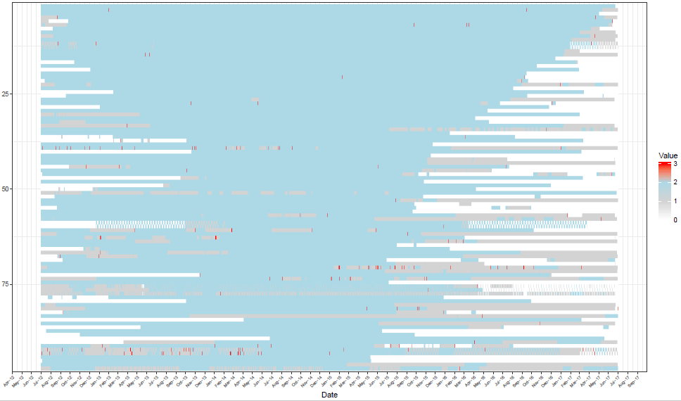
The code that we developed used ggplot and geom_raster layers along with various settings for formatting axes. This R code combined with Power BI gave us BI capabilities. The visuals were seamlessly sliced/diced based on the data we selected in Power BI. I’m attaching here screenshots of visuals that we created using R and Power BI.
Our customers were wowed by the output they saw from the data. Remember, if data is the new oil, then insights in the new king. And we do this using interesting and stunning visuals.
Screenshot 1:
Screenshot 2:
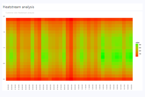
Note: You need large amount of data to have this kind of output. We can further improvise these visuals to be interactive. This can easily be done using plotly and htmlwidgets library combined with Power BI.
The biggest challenge you will face in plotting such visuals is handling large amount of data points on “x-axis”. You may have to use breaks or cuts to limit the points.
Have you plotted heat streams in Power BI/R? What were the most challenging aspects of your project?
We would love to know.
Thank you
R
Note: Next week we will be starting a series of blog posts on how we secure customers data with data anonymization and masking techniques. There are some incredible techniques that we use which give our customers 100% confidence in data security.
Do subscribe to our blog posts to not miss our proven data masking techniques and other interesting articles.
Note: There is a custom visual for plotting heat streams in Power BI, but it cannot generate heat streams anything like what we have shown above.