By 2025, close to 30% of the data will be real time – IDC
We have 6 years before we hit that, but I must say real time data or rather ability to report it real time is key for business success even now.
Imagine a scenario where you could view production plant quality metrics real time on a TV?
A grid operator tracks electricity flows in real time. Metrics like Power, Voltage with trends and power lines plotted on a geo map and viewed LIVE!
Sensory data, campaign performance (as they happen), field sales activity, and many more examples of real time data and real time reporting needs.
Some of the above examples are definitely real time but customers also ask for near real time – as soon as my new data is available I need to view it in my reports and dashboards within couple of mins.
How do we achieve real time and near real time reporting scenarios with Power BI Platform?
There are couple of solutions to achieve this:
Power BI Scheduled Refresh (near real time, 8 refreshes per day for Pro, 48 refreshes per day for Premium/PPU)
Power BI Direct Query or Live connection
Power BI Push data sets
Streaming data sets in Power BI
Next, we will cover real time and near real time reporting scenarios and discuss possible solutions along with limitations/pros & cons. Each scenario and solution is unique, and you can use any of the proposed solutions based on your needs.
Scenarios:
a) I would like to have my sales dataset refresh every 2 hours or I would like to have my Google Analytics dataset refresh every 1 hour.
When your dataset refresh time gap between two refreshes can be more than 30 mins, you can go ahead with scheduled refreshes. This assumes you have imported the data in a Power BI dataset and you would want to refresh that dataset.
Based on our experiences when you present schedule dataset refresh options to customers they are not taken aback. Scheduled refreshes have limits on the number of refreshes per day but once you schedule them to occur more frequently in business hours, it helps.
With Power BI Pro Licenses you can setup 8 refreshes a day per dataset. So you can setup refresh times to be: 7AM, 8AM, 9AM, 11AM, 2PM, 3PM, 4PM, 5PM
Total 8 refreshes spread out in business hours.
With Power BI Premium/PPU Licenses you can setup 48 refreshes a day per dataset. So you could do refreshes every 30 mins! Power BI Premium is definitely costly (read USD 60K/year) but you get more refreshes, more capacity and enterprise level features (AI and more). Update: March 10, 2021.Power BI Premium per user, a new offering, is priced at $20 per user per month.
Or, you can put the workspace where your dataset resides in an Embedded Capacity (Premium/Non-Premium) and get rid of refresh limits. In this case you will have to use Power BI REST APIs to refresh the dataset. Quite simple to invoke. Read more on this capability here.
You can even use Power Automate and trigger refresh based on events.
b) I would like to have my dataset refresh every 1 min (or LIVE)
Assume you have a data source which can be directly queried from Power BI, you can achieve this scenario.
Sales data stored in a SQL box (Azure or on-prem), you setup direct connection to this data source in Power BI. Your Power BI Report is now directly connected to the data source.
If you are viewing this report on a browser you can hit browser refresh and it would fire query live to the source, fetch latest data and show on your visuals.
You can even automate the browser refreshusing a Chrome Plugin. Read more here on how to achieve this.
List of data sources which can be directly queried from Power BI Platform here.
c) I would like to have my production plant quality metrics to be shown live
This assumes the data source where your quality metrics are stored is not direct-queryeable by Power BI.
In this scenario you need to push data from your data source to either a Power BI Push dataset or to a database. This push can be done every 1 min or so. This push can be done by setting up Azure Functions.
Once the quality metrics are pushed to a Push dataset or to a database, you can setup Power BI reports on top of it and view the data live.
Power BI Push datasets have some limitations as mentioned here.
How to setup Push datasets? You can read this external blog post here.
d) I would like to see electricity flows and their Voltage and Power metrics live on my TV
If you need something real and live, something like electricity flows or sensor data, you can setup Streaming datasets in Power BI.
Once you have streaming datasets setup, you can view them through Power BI dashboards. These datasets do not store historical data. They will store limited data in temp cache.
You can open these dashboards in a browser and put them on a TV. No need of browser refresh as the tiles would refresh “live”.
How to setup Streaming datasets? You can watch this YouTube video by Patrick (MSFT) here.
Read more here on Power BI Push and Streaming datasets.
Did we cover all the possible solutions? Ok, let’s check it once more.
Additional Scenario 1: We are a global organization and we would like to view our Google Analytics data every 1 hour. The dataset is shared with our global marketing team spread across every continent.
Solution suggested: In this case instead of going with scheduled refreshes, you can go with pushing GA data to either a Power BI Push datasets or to a database and setting up direct DB connection. Or, if you are an enterprise with Power BI Premium licenses you can set 30 mins refresh intervals.
Additional Scenario 2: I have more than 5 plants where I need to view live data. Should I setup one dashboard with filters?
Solution suggested: You can view data from streaming datasets only in a dashboard. Dashboards do not support filters yet. In your case you can setup 5 dashboards and share these URLs.
This question has been asked multiple times in forums, blogs and in Power BI community.
How can I refresh my Power BI report every min and show it on a TV full-screen?
This is a lovely scenario where you want to show Power BI report with metrics, business performances, team performances etc. on a public display. May be on a TV in a hallway or in Factory Control rooms!
But, how do I do this?
It’s quite simple to setup!
(1) Make sure your data is refresh-able live. Either through direct query to a supported source (SQL etc.) or live connection to Analysis services.
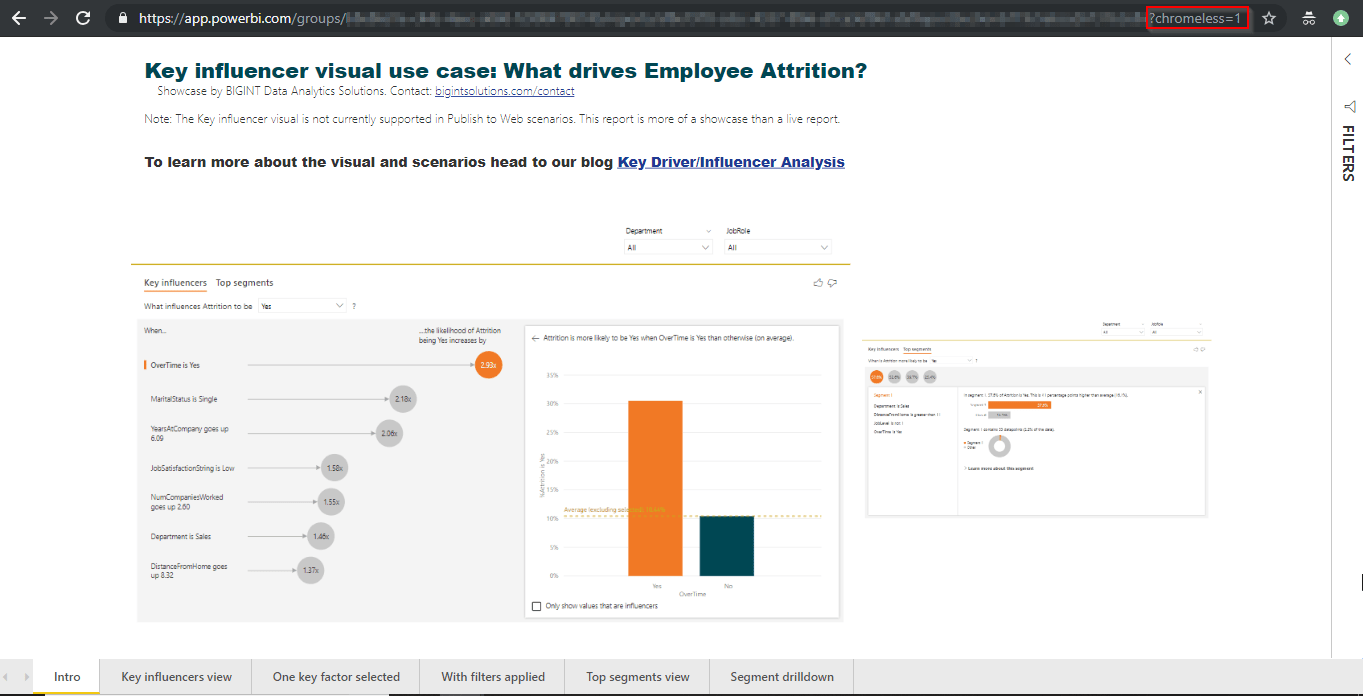
(2) In your report URL in Power BI Service, append ?chromeless=1
This setting will open your report in full screen mode.
(3) Download and install a Google Chrome Add-in – “Super Auto Refresh Plus”
Key driver/influencer analysis using the newly released Power BI “Key influencers” visual.
Key driver analysis or key influencer analysis is critical to understand what factors impact an outcome and/or what is the relative importance of a factor. Example:
What influences employee attrition? Overtime? Job Level?
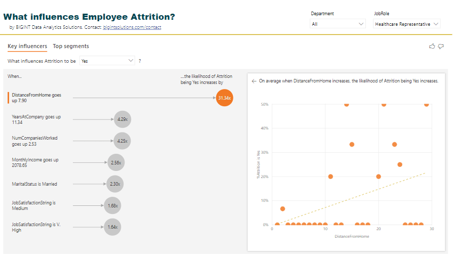
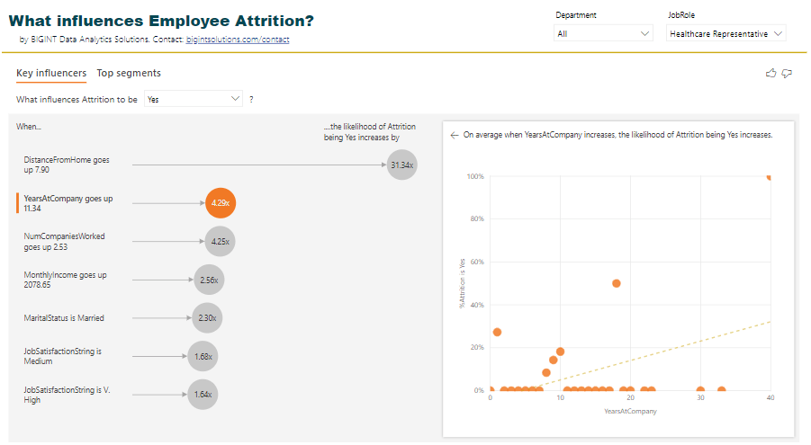
What influences employee attrition in the Sales Executive role? Distance from home?
What influences customer attrition? High call rate? International Voice plan?
Knowing answers to above helps in decision making.
If employees in Job Role “Healthcare Representatives” leave the most because of the distance from home, maybe offer them fuel reimbursement or maybe offer them accommodation expenses if they stay near to office?
The newly released Power BI “Key influencers” visual (released as part of Feb 2019 Power BI Desktop release) aids such analysis very very quickly with no code! Crazy!
We applied this new visual to analyze what drives employee attrition, and I must say, I’m blown away by the outcome, ease of use, and comprehensiveness of the visual.
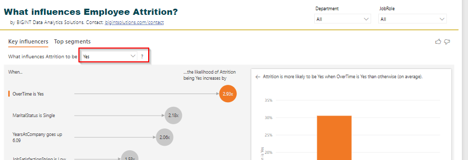
From the visuals above we can clearly see what influences our variable Attrition=Yes. OverTime, MaritalStatus, YearsAtCompany, JobSatisfaction, and so on.
Not only that, the visual also provides the values of the factors which influences our variable of interest the most.
How to interpret the visual?
The likelihood of attrition increases by 2.93x if employees are doing overtime. Or, Attrition is 2.93x more likely in the employees who are doing overtime.
Hmm… if you do overtime, you may quit. This is obvious.
The attrition is 2.18x more likely if employees are single!
Attrition is also high if the Department is Sales.
And so on.
The left-hand side view of Key influencers shows all the factors influencing our “Attrition=Yes” by a factor of 1.0 and above.
The right-hand side view shows the distribution of data with respect to the selected factor and Attrition either as a column chart or a scatter plot.
The dashed line shows Avg. Attrition % of all values except for the key influencer one (in this case except for OverTime = Yes)
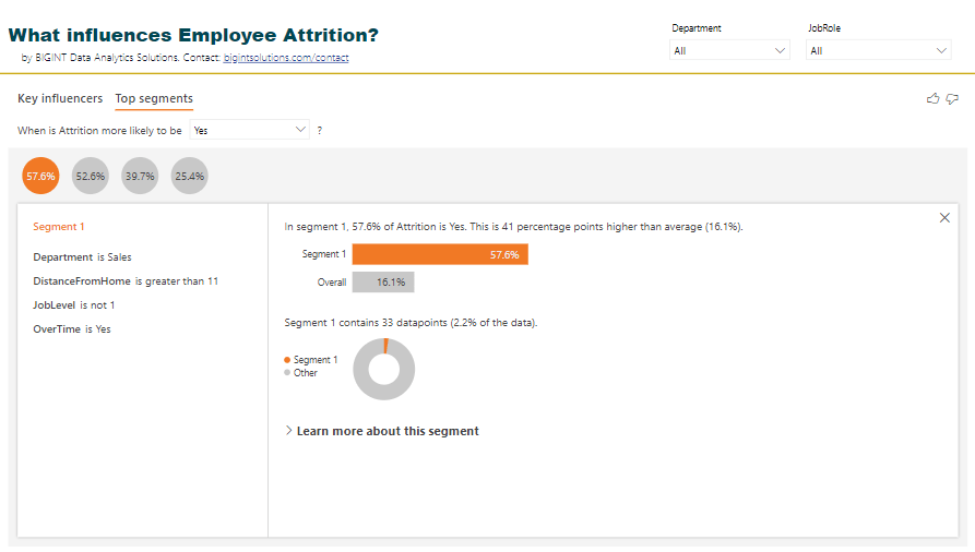
There is another view of this visual where we can see Top segments with high attrition % and their characteristics.
Top segments view in Key influencers visual in Power BI
The visual identified 4 segments with high attrition % along with population count. Clicking on a bubble shows us the characteristics of that segment.
Top segments deep dive
Segment 1 with Attrition % as 57.6 has employees in Department Sales, DistanceFromHome > 11, JobLevel is high and OverTime is Yes.
Wow!
You can further drill down this segment by clicking on “Learn more about this segment” and see what other factors influence this segment.
Quick FAQs on Key influencer visuals and its outcome
Can I filter this visual?
Yes, you can. Example: Why are employees in job role “Healthcare Representative” leaving the company?
Filter the visual and the analysis changes!
Is the visual interactive?
Yes, you can select individual influencing factors and see the distribution of Attrition % by the selected factor.
Can I hover over the values in the scatter plot above?
Yes, you can!
Can I see the logic or p-values associated with factors or key influencers?
No, not yet. This visual is in preview mode. Power BI team may add this feature in the future. Not sure about this.
Can I just see the top X key influencers?
No, not yet. This visual is in preview mode. Power BI team may add this feature in the future. Not sure about this.
I do not see my key influencer in this visual?
Yes, this can happen. Based on my R code using RandomForest, Age should also be an influencing factor for attrition but doesn’t show up in Power BI visual.
See this scatter plot. If Age decreases, Attrition % increases. Maybe Power BI just checks how the “increase” direction of a factor increases Attrition % or Maybe the number of data points for lower age and high attrition is less.
As Age decreases, Attrition % increases
Can I export the data for segments?
No, not yet. This visual is in preview mode. Power BI team may add this feature in the future. Not sure about this.
Does this visual analyze multiple factors and provide conclusions?
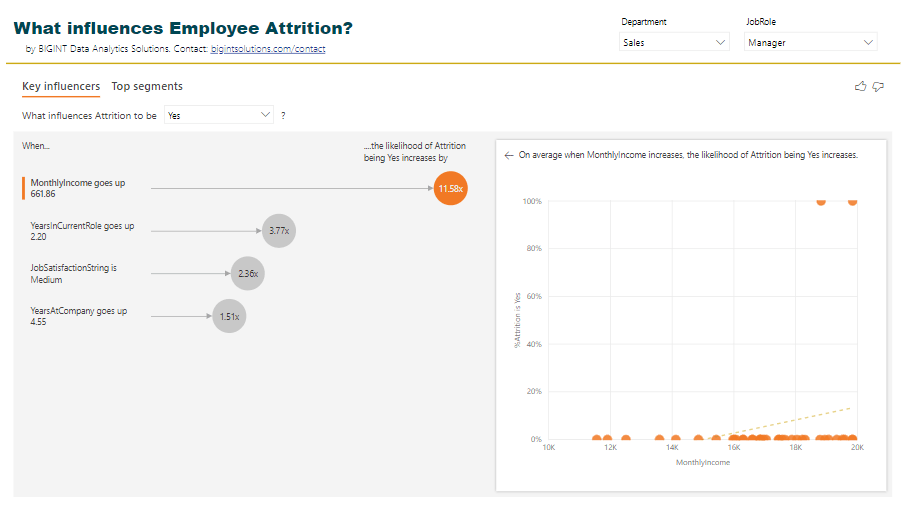
I do not think so. In the example below, the likelihood of Attrition % increases by 11.58x if monthly income goes up. But why is that so? Could it be because for those employees the YearsAtCompany is also more?
Maybe Power BI visual needs to remove outliers.
Power BI visual, currently, doesn’t analyze this for us.
Why are employees leaving if we increase their monthly income?
I want to set this up for my data?
Ok, here are steps to achieve this.
Step 1: Download and Install Power BI Desktop Feb 2019 from here.
Step 2: Enable this visual from “Preview features”.
Step 3: Restart Power BI Desktop. Click on the visual highlighted to put it on the canvas.
Step 4: In the visual data options, drag the field to analyze in “Analyze”, and possible influencers in “Explain by”.
Note: The visual is evaluated on the table level of the field being analyzed. In this case, we are analyzing Attrition, and hence the visual runs at an Employee level. So you may not need aggregations on “Explain by” field. Otherwise, appropriate aggregations are required.
Step 5: In the visual select “Yes” in Attrition value. In your case, select the value you want to analyze.
Step 6: Share analysis with your boss/team/company, and say Thank you to us 🙂
No code, drag and drop solution to key influencers analysis in Power BI!
Simple, huh?
Thanks
Ranbeer
PS: This visual is currently not supported in Power BI Embedded, Publish to Web and Power BI Mobile scenarios.
Tons of questions on how can we copy data from Facebook Ads or HubSpot or Google Analytics or any other SaaS platform or APIs to Power BI.
There are a couple of reasons why you want to analyze data from multiple sources with Power BI.
Why should I care?
Say you want to analyze how much traffic and number of leads (CRM) are generated by spending on Ads on Google and Facebook. And, how many of them actually purchase (Stripe or PayPal)?
You can go to each of these service providers dashboards and get answers to your questions, one by one. Or, you can copy data from these providers into a single system say Power BI and analyze data together. Which one do you think will give you a clear business picture and with much less overhead?
Clearly the Power BI one!
Power BI provides data connectors to a good number of services already. Google Analytics, Facebook Page, MailChimp, SalesForce, MixPanel etc. But there are a number of sources for which you do not have data connectors yet – HubSpot, Facebook Ads, Instagram Ads, LinkedIn Ads etc.
Update (April 30): We have created a list of popular Power BI custom data connectors. The list includes connectors to HubSpot, Zendesk Support, Facebook Ads, Instagram Ads, LinkedIn and more. Check here.
Of late I have been seeing a lot of requests to copy data from HubSpot to Power BI!
What are my options?
This post talks about two general approaches to copy data to Power BI from SaaS platforms and APIs.
Approach 1: Use Power Query (within Power BI) to get data from Online Services (through REST APIs), model, and visualize data in Power BI – Self Service, Simple, Less cost
Approach 2: Setup data factory pipelines using say Azure Data Factory or setup Azure Functions, copy data to a database/data warehouse and use this data layer to visualize in Power BI – Enterprise, More control on data, Involves several components
Which approach to go with will depend on how frequently you want the data pulls andhow you want to reuse the data from these services.
How should I decide?
Questions to ask:
Question 0: How frequently you want to pull data? Every 15 mins? Every 2 hours? Every day?
Question 1: Are you going to use the data only in Power BI/Excel and only for visualization and analysis?
Question 2: Are you going to use the data in another application or going to reuse that data for Machine Learning or other use cases?
Question 3: How big is your data?
If your data pull requirements are every 2 hours or so and is small* and does not have to be used outside of Power BI/Excel and the purpose is only visualization and analytics – go with Approach 1.
Else go with Approach 2.
Approach 1 is quick to implement and will incur a less overall cost.
Approach 2 could take time to implement and has several other components than just Power BI (read on).
Approach 2 also provides you ability to pull incremental data. While in Approach 1 (Pro users) you have to pull full data every time.
Here we take Azure Data Factory to pull data from Google Analytics API.
Note: In the example below “FlattenJSON” is an Azure Function to simplify complex JSON returned by Google Analytics API.
Step 1: Setup data pipelines using say Azure Data Factory and push data to a database/data warehouse
Azure Data Factory v2 data pipelines to copy data from Google Analytics to Azure SQL
Step 2: Connect to the database using Direct Query Approach in Power BI
Direct Query to connect to Azure SQL
Step 3: Start visualizing!
Google Analytics data visualized by us using Approach 2
I have seen customers going with Approach 1 almost always since this saves time and cost. But this approach may require a gateway for data refreshes.
Which approach have you used in similar scenarios? Let me know
Thanks,
Ranbeer M
Note 2: Power BI has dataflows which may replace Azure Data Factory in scenarios above.
Note 3: Power BI team is also working to expose the data model behind the scene as Analysis Services. You can then query the data through SSMS. That feature should come out in preview in Feb 2019. (This date is from Microsoft Power BI blog/website)
Note 4: Power BI team has released AI features in private preview so you can apply ML techniques to your data in Power BI! More on that in this and this blog post.
Note 5: You may contact us if you need similar data movement and analytics for your Saas platforms and APIs!